CSS grid was something I used to shy away from because it wasn’t supported yet by all browsers. I was impressed by how powerful it was and how easy it made making grid-type layouts. But, good old Internet Explorer still had a large market share so we weren’t able to use it widely.
These days, we use it everywhere! It’s so easy and doesn’t require a lot of code to do it. The syntax is mostly familiar with a few new things in there to spice it up.
We still use flexbox often but that is sometimes limited. I personally only use flex because I’m so used to it at this point but am transitioning to using CSS grid as much as possible because it can control so much more than flex. When used in combination, you can really get complicated layouts that used to be so confusing to build - and now it’s just a few lines.
CSS Grid Property
Your grid has to live inside somewhere and we call that the container. Your container just needs the CSS property “display: grid” for it to function as a grid and have its child elements become grid items. Like flexbox, most of the properties go on the parent/container element and impacts how the children are displayed.
.container{
        display: grid;
}
Without additional properties, this just turns the below example into a simple, one-column layout with each child element being a row in that column - kind of like having each child element with the “display: block” property.
Columns (and Rows)
Sometimes I forget what is a column and what is a row - I remember by thinking of Roman architectural columns that go up and down. And, therefore, a row goes left and right.
You can set columns with grid by using “grid-template-columns” to define the width of the columns. There are a bunch of different options on how you can do that so check the examples below.
.container{
        display: grid;
        grid-template-columns: 50px 50px 50px 50px;
}
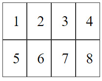
This would make 4 equal columns that are 50 pixels wide. It would look something like this:

You don’t have to use the same width for each column - it can be any width and as many columns as you want.
If you add more than 4 child elements, CSS grid is smart and knows to automatically start a new row with 4 more columns.

This is the HTML I’m using:
<div class="grid-container">
  <div>1</div>
  <div>2</div>
  <div>3</div>
  <div>4</div>
  <div>5</div>
  <div>6</div>
  <div>7</div>
  <div>8</div>
</div>
As you can see, you don’t have to do anything fancy. In just 2 lines of CSS, I’ve created a grid layout that works perfectly.
Spacing
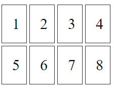
In the above example, all the columns are touching each other. You could use margin or other methods to stop that, or you could use the built-in grid-gap property that takes care of it.
.grid-container {
  display: grid;
  grid-template-columns: 50px 50px 50px 50px;
  grid-gap: 5px;
}

Pretty simple and makes sure it all fits and functions correctly for the sizes of everything.
Fluid Width
So, I’ve shown you how to make static width columns using an exact pixel amount width, but what if you want it to be fluid and take up a percentage of the area of the container? Well, you could use percent (%), which works. Or, you can use the “fr” unit, which stands for fraction.
.grid-container {
  display: grid;
  grid-template-columns: 1fr 1fr 1fr 1fr;
  grid-gap: 5px;
}

So, it’s a little different than using percents in that it does some fancy math based on the total width of the container and the fractional amounts of the other columns. The 1fr’s used above tells it that they should all be the same percentage width of the container so that they take up the whole width of the container. It’s dividing them up into equal percentage widths. So, the container can be any width and it’ll do the math to figure out what they should all be.
If you want columns to be wider than the others, you would use a number larger than 1.
.grid-container {
  display: grid;
  grid-template-columns: 1fr 1fr 2fr 1fr;
  grid-gap: 5px;
}

Now, it’s doing a little bit more algebra to figure out what 1fr would be and then adding in something that’s twice as big - a column that’s 2 1fr’s and then adding in 3 other 1fr’s.
Also, you don’t have to use the same units for each columns. You can mix in px and fr - try it!
.grid-container {
  display: grid;
  grid-template-columns: 1fr 150px 2fr 1fr;
  grid-gap: 5px;
}
