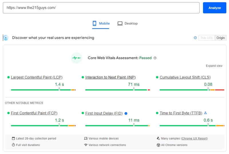
Measuring your website’s success is just as important as creating your website in the first place. A website can provide a wealth of data on customer decisions, behavior, preferences, and their buyer journey. In a similar way, those users will help reveal valuable data about your own website including loading speeds and layout. Those insights are valuable for anyone looking to scale or improve their business, and the metrics that makeup that data are known as Core Web Vitals (CWV) most easily found at https://pagespeed.web.dev/. While there’s a wide range of metrics that can help you hone your site, the CWV typically refers to just 3 of them: Largest Contentful Paint (LCP), Cumulative Layout Shift (CLS), and Interaction to Next Paint (INP).
We’ll delve into the specifics later, but ultimately they cover your website’s speed and interaction as well as the user experience created by them. If you think you can get away with ignoring these metrics, you won’t, because it could impact both UX and your SEO.
Search engine optimization has helped many customers find the right product, and vice versa. It’s more than just keyword research though. One of the many benefits of using CWVs are improvements to the User Experience (UX). As you’ll read your UX absolutely affects your SEO, which means if you ignore those metrics you could see your site falling down Google’s search results. I bet you’re paying attention now.
So instead of assuming you have every website detail figured out, here’s an informative article that could completely change your pages. Let’s talk about those valuable Core Web Vitals and how they impact SEO and UX.
We make some damn good websites.
Hit Us UpCore Web Vitals

Largest Contentful Paint (LCP)
Your website is almost an entirely visual medium. That means your graphics and loading speeds are of the utmost importance, and that’s what your LCP measures. It’s the time it takes for the largest visible graphic or block on your page to load. Why does it measure the largest and not the smallest? Because that will likely be the last element to load on your page, meaning that users don’t get the full experience until that completely loads.
Cumulative Layout Shift (CLS)
Have you ever been on the mobile or desktop version of a website only to see some of the layout elements move when you scroll? That’s what the CLS measures. Whenever any sort of button, graphic, image, or text block moves unexpectedly it demonstrates instability and a fairly poor UX, so the lower your CLS score is the more stable and consistent your website is.
Interaction to Next Paint (INP)
The longer it takes for your website to react to a user interaction the less likely they are to use your website. When you press a button on a website you expect it to react immediately, but that’s not always the case. The INP measures the time it takes for a page to respond to user interaction, whether it’s clicking, tapping, or swiping.
Thank Google for CWVs
Together, these 3 vitals encompass a huge amount of research, development, and design. The goal is to optimize and improve performance when you use them and that was actually Google’s intent when they were first put together.
In May 2020, Google introduced the Core Web Vitals to the world. Unfortunately, one of the original members known as First Input Delay (FID) has since “left the band”, replaced by the more efficient INP metric. While Google doesn’t necessarily have your exact goals in mind, they ultimately want you to succeed as much as you do. They added these core metrics so that website UX impacts their search result rankings, which made every web developer and designer take notice. So improving your CWVs benefits both you and Google, but how exactly do these metrics do that?
What Really Matters In Core Web Vitals?
Understanding the concept does not mean you understand why it’s measured. Those CWVs don’t encompass every website metric, but together they paint a picture of your user experience in an efficient and digestible way. So that when you need to make improvements you know exactly where to make them.
Instead of assuming you need to get a new web host just to improve a single page’s loading speed, here’s what you actually need to pay attention to with your CWVs.
LCP
More traffic equals more sales, that’s just inevitable. The problem is when your page elements don’t load quickly enough you end up with a higher bounce rate. Users don’t want to linger and wait for anything. They’ll just head to the next website. A faster loading speed keeps users engaged, gets them to their desired pages quicker, and doesn’t leave them with doubts about your website and overall business.
INP
Just because your page is loaded doesn’t mean the user’s having a great time. We’ve all spent a minute clicking a website button only to realize it’s broken or unresponsive. The more prevalent those issues are on your page, the worse your UX is. Users are picky and impatient, they’re not going to wait for your page to respond, they’ll just close it and head to the next one.
CLS
Consistency is crucial to maintaining brand identity. Users expect every aspect of your business to have the same quality and that extends to your website. Poorly-formatted websites aren’t just frustrating, they can completely affect how you view a company. When a website unexpectedly shifts or alters while you’re using it you might think you’re being hacked. So instead of creating frustrated visitors who won’t become customers, ensure your website’s visual elements are stable and consistent.
Which Metrics Matter Less Than Others
So if Google established “core” metrics it’s probably safe to assume some aren’t so vital to overall UX or website performance. This is also something everyone should be on the lookout for as some websites or developers boast about the success of their work they could just be talking about Vanity Metrics.
Vanity Metrics
Just like an overly complex resume, Vanity Metrics might look good, but they don’t indicate growth or success the way CWVs do. These are numbers that could look impressive to the average website visitor or owner just due to their size. They could represent high Pageviews or Video Views.
Having a hundred thousand views on your home page video is admirable. It’s not an indication of any success, though.
Social Media followers are another vanity metric. First of all, if you’ve got a spare $20 in your PayPal account you can likely buy a few thousand followers in a minute or two. Having a large follower count is nothing compared to more significant forms of engagement. The same goes for shares, comments, or even basic visitor count metrics. Those vanity metrics are purposefully chosen due to their high numbers. Don’t be fooled and don’t let them distract you from the metrics that emphasize the user experience and not just the user’s initial visit.
Over-Optimization
Not every tool or asset on your website needs to be of the highest resolution or quality. Users tend to favor simplicity over complication, with research indicating that 64% of them prefer simple website designs. Complex tools and pages are harder for the average user to navigate and those high-resolution videos or images are harder for the average user to load.
If it wasn’t obvious, having a 4K video on your page would be harder for most users to play. That will lower your LCP, which literally measures how long it takes content to load. Compress files whenever you can - fonts, images, videos, whatever helps make the page easier to load.
How To Balance CWVs with Overall UX
Just like trying to avoid over-optimization strategies like keyword stuffing, there’s a balance to maintain for these CWVs. No website should be at the mercy of constant shifts and adjustments based on the latest data. That might not damage your website but it could damage your reputation to repeat customers looking to repeat their previous experience.
Implement monitors to give you data from real users, that’s arguably the first step, but don’t let that data dictate everything. Draw on real behavior, maybe even engage with users, and give them the opportunity to offer their feedback with report opportunities.
Identify your business goals and focus your UX on achieving them. CWVs are important but don’t sacrifice key assets or over-optimize just to shave off half a point from your CLS score. User satisfaction should still be your main priority for your website UX.
Practical Tips for Optimizing What Matters
Improving your CWVs isn’t easy. It takes strategic planning and execution. Instead of throwing you to the wolves though, here are a few steps you can take to get your CWVs heading in the right direction.
LCP
- Minimize your Javascript and HTML Files
- Prioritize “Above the Fold” content
- Upgrade your web host plan or provider
- Optimize images, videos, and fonts
- Generate CSS
INP
- Exclude interaction overlap
- Defer non-critical CSS
- Use Web Workers
- Exclude long tasks
CLS
- Fix image and ad sizes
- Reserve space for elements
- Avoid content shifts
- Preload fonts
CWV Monitoring Tools
Last but not least, here are a few tools that you can use to monitor all of your Core Web Vitals.
There are alternatives (and alternatives to Gtmetrix), but these have proven capabilities and millions of happy customers. Speaking of happy customers, they’re ultimately the focus of this article. UX is all about optimization, that’s true, but the goal of that optimization is to improve the user’s experience. Their behavior can and should dictate design choices and layouts.
Images and videos should be compressed so they can be enjoyable instead of frustrating and that takes a mix of monitoring your CWVs without succumbing to over-optimization.


