Hello there, law gurus! In this world, where everything is a Google search away, your online presence matters – and it matters big time! As a bankruptcy lawyer, you're the beacon of hope for people drowning in the turbulent sea of financial troubles. But, how do you assure them that you're the right person for the job? You guessed it – through a well-designed, trust-inspiring, user-friendly website (at least, that’s our obviously biased opinion)!
We make some damn good websites.
Hit Us UpBest 9 Bankruptcy Lawyer Website Designs
Building Trust Through Website Design
We, humans, have a simple formula – we stick with what we know, like, and trust. So, let's make your website the digital embodiment of this golden rule!
Show Yourself
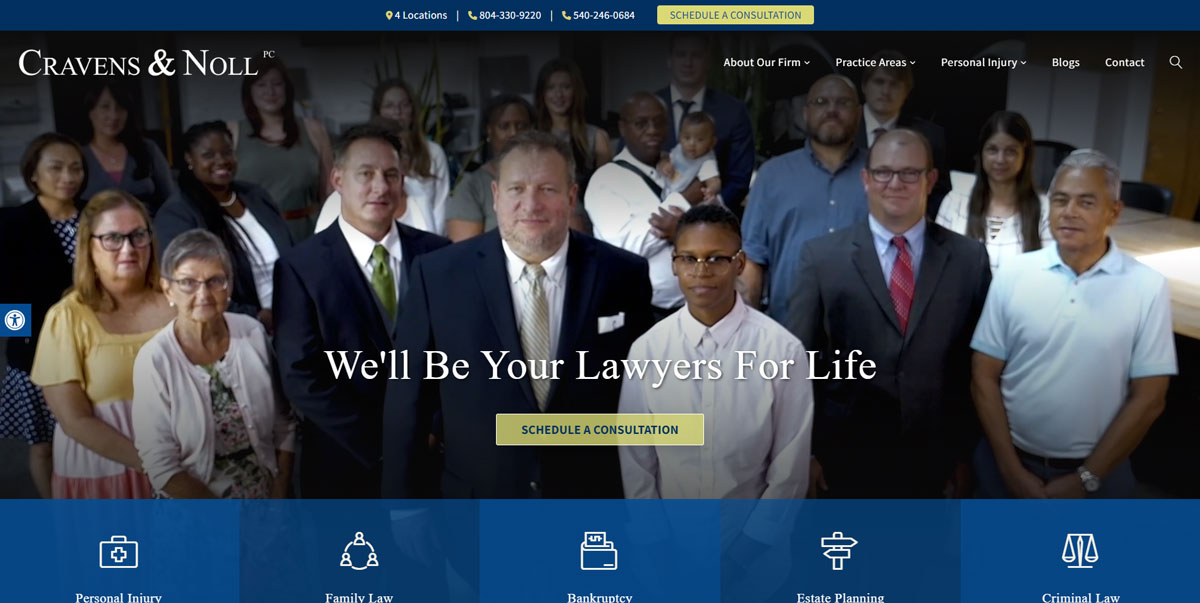
Don't be shy! Let your pictures shine on your website. Having professional photos of yourself gives your website a face and makes it more relatable. It lets your potential clients know who they'll be dealing with and adds a sprinkle of personality.

I for one find lawyers scary (along with dentists), so we always suggest making yourself look like a nice, approachable human.
And don't just stop at your headshots - include your team and anyone else you work with. If you don’t have a team, don’t worry about it.
Don’t forget to add a detailed bio. Not just your qualifications and experiences (which are super important, of course!), but give them a glimpse into your journey. What made you choose bankruptcy law? Who are you outside the courtroom? These little things make you more human, more relatable, and bam! You're not just a lawyer anymore; you're someone they know and can trust.
The User is King
Now that you've got their trust let's make their life easier. You want to make sure that it's as easy as pie for your potential clients to contact you. The 'Contact' or ‘Consultation’ button should be as clear as a sunny day. Whether it's through a contact form, live chat, or your direct contact details, make sure that reaching out to you is a no-brainer.
And here's a little secret – the cool kids don't like clutter! Modern, clean, and intuitive design is what's in these days. Make your website a joy to navigate. It should guide your visitors through a beautiful park, not lead them into a maze, and don’t bombard them with flashy buttons and forms.
Another thing that can shoo your visitors away is a slow website. No one wants to wait for ages for a page to load, right? A speedy site not only improves your user's experience but also gives you brownie points with the big G – Google!
Detailing Your Services
Remember, your website is not just about selling; it's about informing too. So, roll out a clear, concise list of all the services you provide.
The best page structure for this area of your website will be something like this:
- Services/Practice Areas
- Bankruptcy Law
- Chapter 13
- Chapter 7
- Foreclosure
- Family Law
- Divorce Law
On the main services page, list all the services that you offer. It’s common to see them as a grid with matching icons and descriptions. On each practice area page, make sure you provide unique information about each.
Now, here's a little trick – talk both lawyer and human. Use both legal terms and simple language. Not all your visitors might be well-versed with the legal lingo, and that's okay. By speaking their language, you're making them feel comfortable and included.
Showcasing Social Proof and Recognition
Last, but definitely not least – let your accolades do the talking! There's nothing that screams credibility louder than awards and recognition. It's like your website's very own trophy cabinet!
And what about reviews and testimonials from previous clients? They're like those five-star ratings that make you choose one restaurant over another. They can tip the scales in your favor and give potential clients that final push to pick up the phone and call you.
The most common method of doing this is through award badge images and Google reviews feed. If you didn’t know, Google reviews are some of the most trusted in general - so focus on those. These should be one of the first things that people see when they come to your website.
And that's all we have for you about bankruptcy lawyer website design. If you're interested and want to know: what we charge for a lawyer website.


