The Americans with Disabilities Act (ADA) is an important piece of legislation. When it was initially designed, the ADA was meant to protect those who are differently abled. It ensured they could use the same services and enjoy the same benefits as the other members of society. Largely, it’s done just that. It’s the reason those who need it have easy access to parking, and it’s why there are convenient ramps at most businesses' entrances. For some Shopify site owners, I’ve written about how the ADA can be used as a nuisance, making compliance a necessity for anyone looking to avoid a lawsuit. Some use it maliciously, but for those who are visually impaired, it’s a game changer.
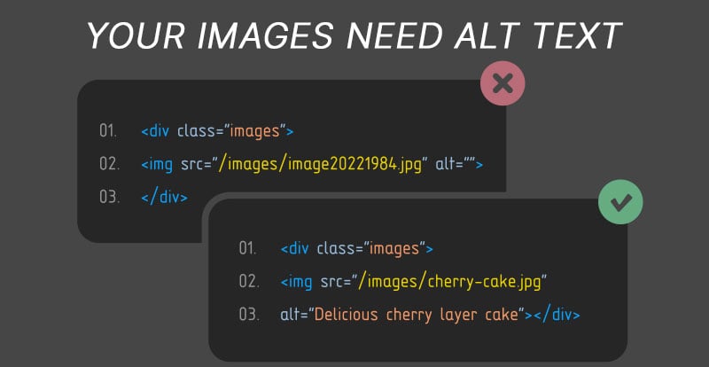
Text-to-speech software has made it so that almost anyone can use the internet, but it’s not perfect. To ensure your website is ADA-compliant, you need more than basic buttons and navigation. Let’s talk about using descriptive, but concise, Alt Text for the images you’re using.
How To Stay ADA Compliant for Alt Text
When an image is uploaded to a web page, there should be some form of description. If the image is owned, it needs to be credited. If it needs to be contextualized, there should be a caption. These aren’t just suggestions, they could be copyright issues. Rather than face a lawsuit or fine, try to be safer than sorry. The same goes for Alt Text.
No, it’s not credit or captions, it’s a description. For those who use a Screen Reader, their eyesight may be incapable of discerning even large or basic images regardless of color or resolution. Alt Text is specifically written so that it can be read aloud by one of those readers. If you’re wondering why you suddenly need to take the time to describe every image, think about the benefits. First of all, it helps a user have a better understanding of your website. If that includes anything from an image of a product to a location, it ensures they have a similar experience to those who can see the images with complete context.
Other than that, did I mention it helps you avoid a lawsuit? The nuance of Alt Text comes in whether or not you write a short sentence or a lengthy paragraph for that description.
What is the “Perfect” Alt Text?
When it comes to a lot of regulations, there can be a lot of ambiguity. That’s not ideal for businesses or shop owners looking to comply. They want simple rules that are equally simple to follow. Unfortunately, ADA compliance isn’t as cut and dry, but they have provided users with a list of tips that are specifically about Alt Text. The page itself includes links to numerous posts about general web compliance, so make sure you’re using that resource.
Here’s what they have to say about the best practices for Alt Text.
Alt Text Best Practices from the ADA
- Use simple and understandable language - avoid unnecessary adjectives or descriptors that are more decorative than informative.
- Keep it simple and short - complex images will not add context or meaning to those who are unable to experience it in the first place. Unless there is a specific narrative or action, keep Alt Text short and basic.
- Remove unnecessary words or language - the Screen Reader will know what the Alt Text is for, as will its user. There’s no reason to begin it with, “This is a picture of…,” when that’s already the point of Alt Text.
For logos and branded content, Alt Text isn’t necessary, but a simple description saying what it is will be appreciated.
Tips for Complete ADA Compliance
Ultimately, keeping a website ADA-compliant centers around these specific impairments.
- Auditory - If your website features lots of animation or videos, there needs to be both titles and captions. Many of those with hearing impairments are talented lipreaders, but for videos with narrators, they are left completely in the dark. Ensure that every video has proofread captions and titles so that every user has a similar experience on your website.
- Visual - As this page describes, many users will be experiencing your website by audio description alone. Pages and menus need to be easily described and navigated to, that way a user is never confused about the content they’re hearing.
There also needs to be a comprehensive accessibility policy page on your website. Describe the measures you’ve used to remain compliant. Offer contact information and easily accessed accessibility forms. Not sure if you’re compliant yet? Don’t worry, there are numerous accessibility checkers with solid reviews. Don’t leave it up to chance or opinion, get expert advice.
Importance of Improving Accessibility
As has been reported, not every ADA lawsuit is made in good faith. California is currently having a problem where websites and brick-and-mortar locations are being sued by the same firms and defendants. In many of those cases, the defendant has never even stepped onto the property or experienced the website, they’re just aware that a certain curb is too high or that a website doesn’t feature enough menus. Those users don’t want compliance, they want a settlement, and they are not the reason why the ADA exists.
The ADA exists because accessibility is equality. It might require an extra step or two, but it quite literally increases the ability to get more customers. So what’s not to like? Impairments can seem minor to those who don’t have them, but they could easily prevent someone from getting into your business. Whether that business is done online or in a storefront.
Don’t limit your market and don’t make yourself vulnerable to frivolous and unnecessary lawsuits. Alt Text gives those who need it a little more context and a small and descriptive helping hand.


