Colors don’t just represent style choices, they have a function. Whether you realize it or not, you’ve been manipulated by color science since you were born. Brands, products, and especially websites use their colors as an advantage, drawing you in without you noticing. For hundreds of years, we’ve had theories about what certain colors mean, and why some are so pleasing to see together. The first person to come up with the idea of “color theory” wasn’t an advertiser in the 20th century, it was Sir Isaac Newton. The color wheel grew from an idea Newton had about light splitting through different prisms. Through that, we developed the idea of the primary colors (red, yellow, and blue) as well as forming color theory.
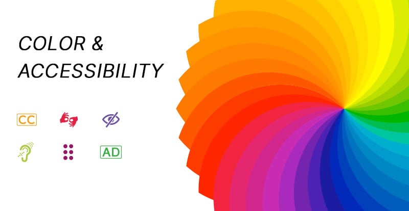
There’s a reason that the poisoned apple in Snow White was green, and it’s not because there are green apples. There’s a psychology to what certain colors mean, what emotions they elicit, and how they can influence a customer’s decisions when they hit your website and how much time they spend on it. Colors also play a significant role in the accessibility of your website, namely its color accessibility.
Sadly, not everyone experiences the color spectrum the same way as Sir Isaac. Some people have mild to severe color blindness or other differences in their vision. That means that the bright website you spent hours designing could be unreadable to about 7-8% of the population, who are color blind. So how do you use color theory to choose pleasing brand and website colors that meet color accessibility standards? You take some advice.
Let’s talk about how you can use both color accessibility and color theory to improve your website.
Why Color Accessibility Matters
Think about color contrast as more than just making things look good—it's about making your site usable for everyone. When colors clash or don’t stand out enough from each other, it can be really tough for people with visual impairments, like color blindness, to make sense of what’s on the screen. The rules say you should have a contrast ratio of at least 4.5:1 for normal text and 3:1 for larger text. This helps make sure that your text pops against its background, so everyone can read it easily.
You can make this happen by using tools that check your color combos to make sure they're up to scratch. Including a contrast checker right from the start of your design process can save you a headache later and keeps your design accessible to all. You can test color contrast here: https://webaim.org/resources/contrastchecker/

The above example shows text in white that is a good example of basic accessible text with a contrast ratio of 21:1. The other text says "not accessible" in darker text that only has a contrast ratio of 1.99:1.
And it’s not just about following rules—choosing the right colors can also make your site feel more inviting. Avoid tricky combos like green and red, which are a no-go for color-blind users. Instead, go for shades that are easy on the eyes but still stand out. You want everyone to notice important buttons or calls to action, right?
So, keep in mind, good color contrast isn’t just about ticking off a checklist; it’s about making your site work better for everyone who visits. Keep your site fresh and in line with the latest standards to show you care about all your users.
When to Use Color Accessibility
Every single box, form, graphic, or text block can be clearly visible when utilizing contrasting colors. By increasing the color accessibility, you make your content easier to read for users suffering from even mild vision issues. Using carefully chosen contrasting colors also helps when some users access your website from different screens. Prioritizing color accessibility in your designs keeps users from adjusting brightness levels or clicking away immediately.
That doesn’t necessarily tell you which colors to use, though. That’s why we have color theory.
Understanding Color Theory
Color theory is as complex and as simple as you think it is. Ultimately, color theory suggests that certain emotions have emotional connections and when combined, certain color combinations are pleasing while others aren’t. Individually, colors are known to elicit different reactions. Color theory also rightfully suggests that certain color combinations harmonize better than others.
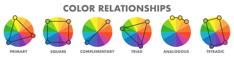
When looking at the circular chart, the combinations start to reveal themselves. Instead of looking at similar colors, look across the chart to those that contrast. The best color combinations are those that are complementary (across the chart), triadic (triangle across the chart), square (square across the chart), or tetradic (rectangle across the chart). Those combinations have created some of the most recognizable brands and color combinations ever known.
Red and green are the perfect examples, complementary colors that now represent an entire holiday without any other symbolism. You can’t buy that kind of marketing recognition for a logo or a website.
Oh, wait - you can! Every logo or brand color combination utilizes color theory. Some are just doing it better than others. These combos lead to pleasing designs that help connect brands with their market, but there’s an even deeper science behind them.
So What Do Different Colors Mean?
There’s a certain amount of subjectivity based on preference, of course, but it’s universally accepted that certain colors mean certain things. Color psychology connects those colors to the behavior or feelings we feel when we see them. Here are some examples:
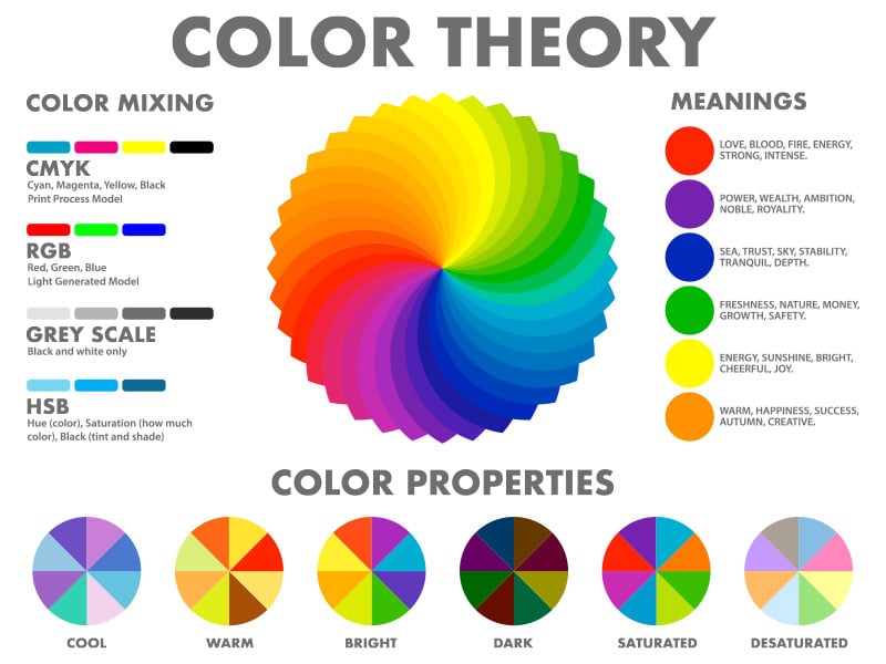
Black - Confidence, Boldness, Luxury
White - Simplicity, Elegance, Positivity
Red - Danger, Joy, Anger
Gray - Neutrality, Intellect, Refinement
Green - Nature, Wealth, Health
Pink - Youth, Affection, Compassion
Blue - Bravery, Thoughtfulness, Inspiration
There’s a reason why one lightsaber is red and the other is blue. Does that mean everything that uses the color red is evil? Not at all, just ask Marvel, Netflix, Coca-Cola, Target, CNN, and dozens of other major corporations. Each one of those brands is much closer to the “joy” aspect of the color red than its other meanings.
So for users developing a website that reflects their brand, see what meanings or ideals on that list stand out to you. Let your brand identity help determine the colors you choose.
Choosing Brand Colors Using Color Accessibility & Theory
Combine your preferences with color theory and accessibility to make a brand and website that attracts the most customers. Not every brand needs more than one color, but your website will. To achieve true accessibility, you need contrasting colors that make pages more readable and discernable for everyone. The user experience is the one you’re website should be focusing on, not yours, so cater to as many users as possible.
Color theory, and psychology, can also help you determine the colors you choose for your website. Not only should you use multiple colors, but they should be complementary and contrasting. While logos can get away with being a single color, your website can’t so use every edge you can to keep users on the page. By choosing colors that draw attention instead of inviting distractions, you’ll create an awesome website based on both style and science.